For years, we’ve been told to keep things clean and simple: neutral tones, lots of white space, a soft beige filter. That was the aesthetic era of marketing, minimal, curated, and calm.
But lately, something loud has taken over.
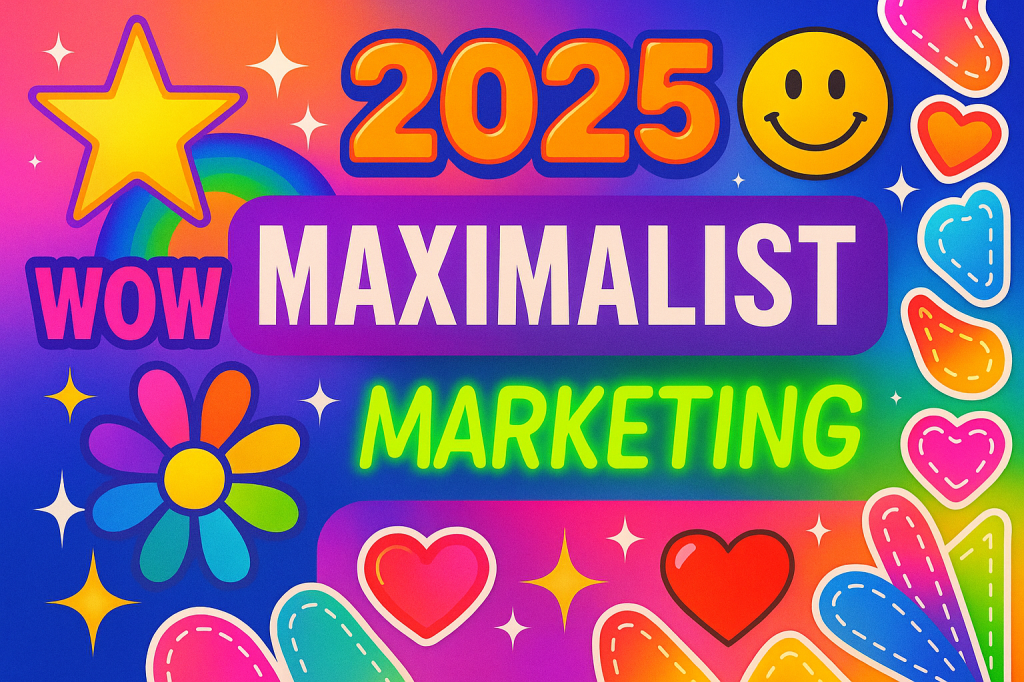
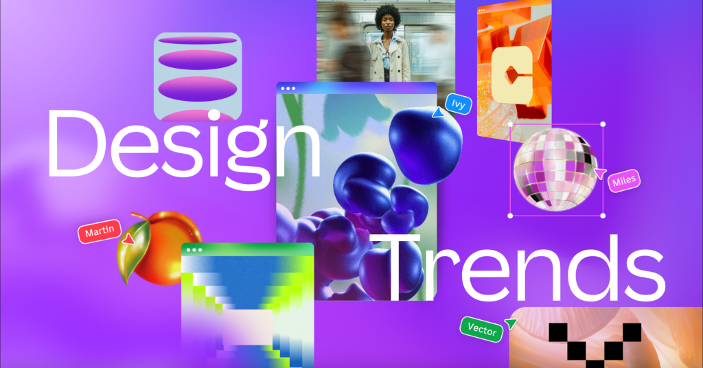
Feeds are exploding with colors. Fonts are clashing. Ads look more like sticker-packed Pinterest boards than polished campaigns. We’ve officially entered the age of maximalist marketing, and it’s everywhere.
So what is maximalist marketing, and why are brands choosing chaos over calm? Let’s break it down.
What Is Maximalist Marketing?
Maximalist marketing is the design trend where more is more. It focuses on being bold, attention-grabbing, and visually rich. Think of:
- Bright, saturated colors
- Mixed fonts and overlapping text
- Stickers, emojis, sparkles
- Loud visuals that demand attention
- A little bit of chaos (on purpose)
It’s the opposite of clean, quiet branding. And it’s not trying to be subtle—it’s trying to be seen.
Why It’s Trending Right Now
In 2025, the internet is louder than ever. With so much content fighting for attention, subtle designs are easy to scroll past. That’s why brands are leaning into bold, overstimulating visuals—to stand out in the noise.
Here’s why maximalist marketing works today:
- It catches your eye instantly.
- It feels fun, real, and unfiltered—especially to Gen Z.
- It works perfectly for short-form content like TikToks and Reels.
- It breaks the mold, and people remember what stands out.
Now let’s look at brands doing it right.
5 Brands That Do Maximalist Marketing Really Well
1. MSCHF — Marketing Through Chaos
MSCHF is known for weird, attention-grabbing products like the Big Red Boots or Eat the Rich popsicles. But their design style? Pure maximalism.
- Their visuals are often loud, weird, and meme-ready.
- Campaigns are packed with humor, irony, and bold visuals.
- Their content looks like it was made to go viral, because it is.
Why it works:
They understand the internet loves the unexpected. Their designs aren’t clean, they’re chaotic on purpose. That unpredictability is part of the brand’s personality.
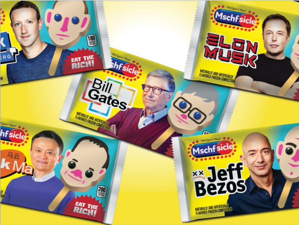
MSCHF’s “Eat the Rich” Popsicles
Satirical, absurd, and visually impossible to ignore, MSCHF turns political commentary into popsicle packaging that screams maximalism.
2. Poppi — Bright, Bold, and Bubble-Coded
Poppi is a prebiotic soda brand that made gut health fun, flashy, and social-media-ready.
- Their packaging is neon, bubbly, and full of emojis.
- Instagram ads look like a mix between a pop art collage and a TikTok meme.
- They use fonts and colors that pop—literally.
Why it works:
In a market full of “clean wellness” brands, Poppi chose fun. Their aesthetic makes you smile, screenshot, and share. They’re branding health with high energy.
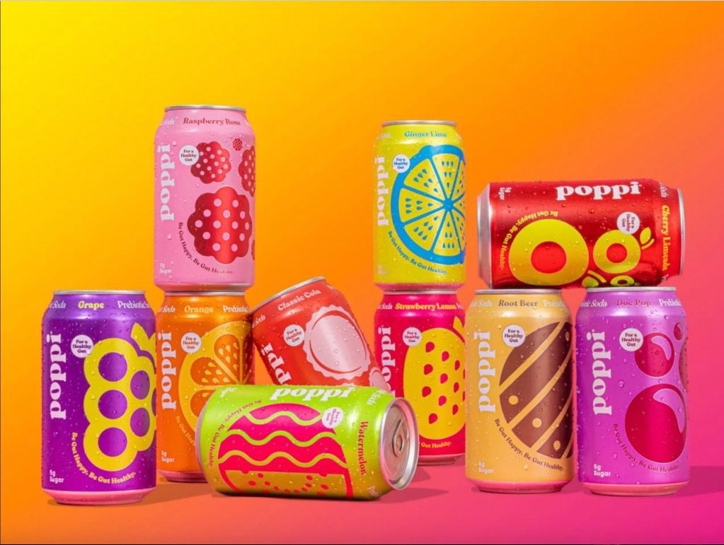
Poppi’s design is a dopamine hit, emoji-laced, bold, and joyfully chaotic.
3. Duolingo — The Unhinged Owl That Wins TikTok
Duolingo’s TikTok game is unmatched. Their green owl mascot went from educational sidekick to Gen Z icon.
- Their videos are loud, fast-paced, and meme-heavy.
- The green color is everywhere – on props, backdrops, and even lighting.
- The tone? Chaotic, funny, and deeply self-aware.
Why it works:
They ditched the idea that education needs to be serious. Their design and voice are all about being relatable, not perfect. It’s maximalism for engagement.
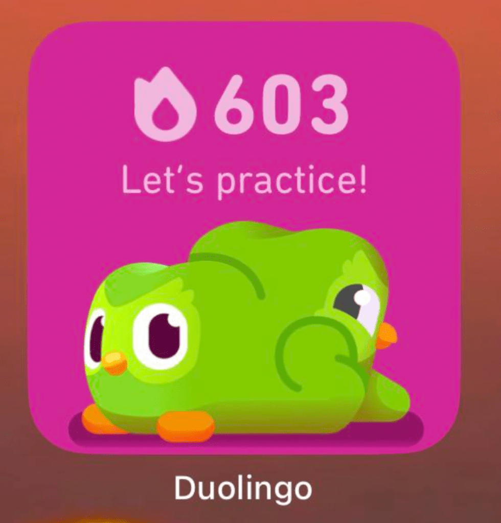
The green owl’s not just reminding you to study—he’s starring in viral marketing.
4. Starface — Acne Stickers That Spark Joy
Starface took something everyone hides (pimples) and made it fun to show off. Their products? Bright yellow star-shaped pimple patches.
- Their branding includes comic-style fonts, bold color blocking, and emojis.
- Instagram is full of selfies, sparkles, and playful designs.
- They built a world where skincare is cute and expressive.
Why it works:
Instead of blending in, they stood out – literally. Starface made skincare a statement, not a secret. The more chaotic and fun, the better.
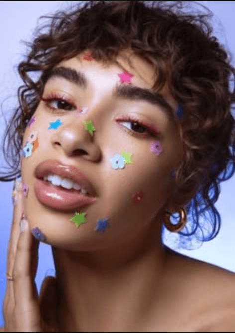
Starface turned acne into an aesthetic. Maximalism meets skincare.
5. Canva — Turning Up the Volume on Templates
Canva was once known for clean, simple design templates. But lately, even they’ve embraced the maximalist trend.
- Their 2025 templates feature glow effects, rainbow gradients, Y2K fonts, and sticker overload.
- Design suggestions now include sparkles, drop shadows, and GIF-like elements.
- It’s less “corporate deck,” more “digital scrapbook.”
Why it works:
Canva is reflecting what creators want, designs that pop. Their shift shows how maximalism has gone mainstream, even in design tools.
Even Canva got the memo: chaos-core is what creators want.
So, What Does This Mean for Marketers?
The era of clean, quiet design isn’t over, but it’s no longer enough.
Maximalist marketing is a response to how people consume content today:
- Fast
- Visually
- Emotionally
People are drawn to what feels real, messy, and memorable. And brands that embrace that chaos, without losing clarity, are winning attention.
Final Thought
Minimalism whispered. Maximalism yells, with glitter, glow text, and a whole lot of Gen Z energy.
Whether you love it or hate it, one thing’s clear:
Maximalist marketing isn’t a trend. It’s a survival strategy.

Leave a comment