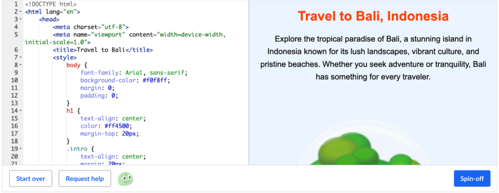
As part of my Web Design and User Experience coursework, I developed a fully functional travel-themed webpage using HTML5 and CSS3.
This project focused on practicing structured layouts, applying styling with CSS classes and IDs, and ensuring responsiveness for mobile devices.
Project Overview:
- Objective: Create a structured, visually appealing, and responsive webpage from scratch.
- Technologies Used:
➔ HTML5 for page structure
➔ CSS3 for layout, typography, and visual styling - Key Focus Areas:
➔ Organized use of headings, paragraphs, images, and lists
➔ Applying internal and external CSS for styling
➔ Using CSS IDs, classes, fonts, and background settings
➔ Implementing a meta viewport tag for mobile responsiveness
Features of the Travel Webpage:
- Hero Section: Eye-catching title banner with destination imagery
- Destination Highlights: Structured content blocks with images, lists, and links
- Mobile Optimization:
➔ Responsive text scaling
➔ Adaptive image handling
➔ Simplified layout for better mobile UX - Clean, Accessible Code: Semantic HTML elements for readability and SEO best practices
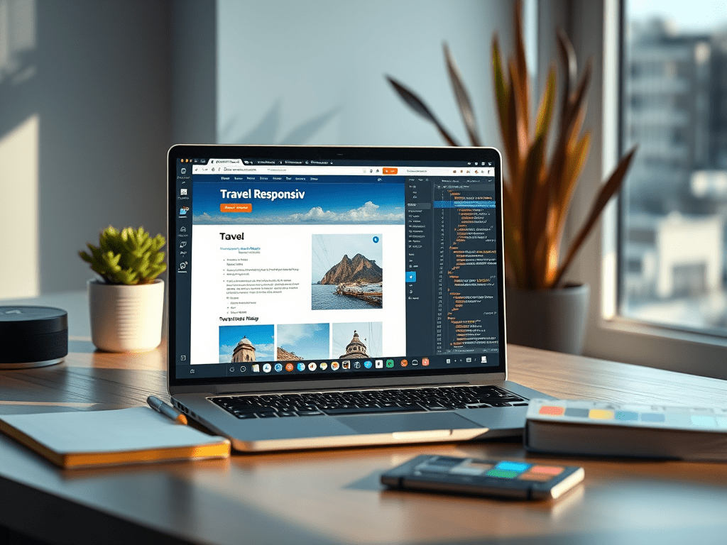
Screenshots:
What I Learned:
- The importance of semantic HTML structure in ensuring clean, accessible design
- How to use CSS selectors, IDs, and classes efficiently
- Best practices for responsive web design to enhance user experience across devices
- Strengthened my understanding of visual hierarchy, color schemes, and font pairing in web design
View the Full Project:
Final Thoughts:
This project helped me bridge creativity with coding fundamentals. It sparked my growing passion for building digital experiences that are not only visually appealing but also user-centered and accessible.
I’m excited to continue expanding my skills in front-end development, UX design, and interactive content production in future projects!
 Mansi's Blog
Leave a comment